


Client: Breast Cancer Canada
Project: Breast Cancer Canada Full Identity Rebrand
Design Lead: Teresa Tam
Agency: 123w
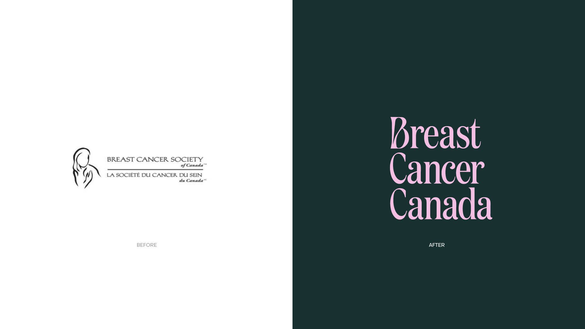
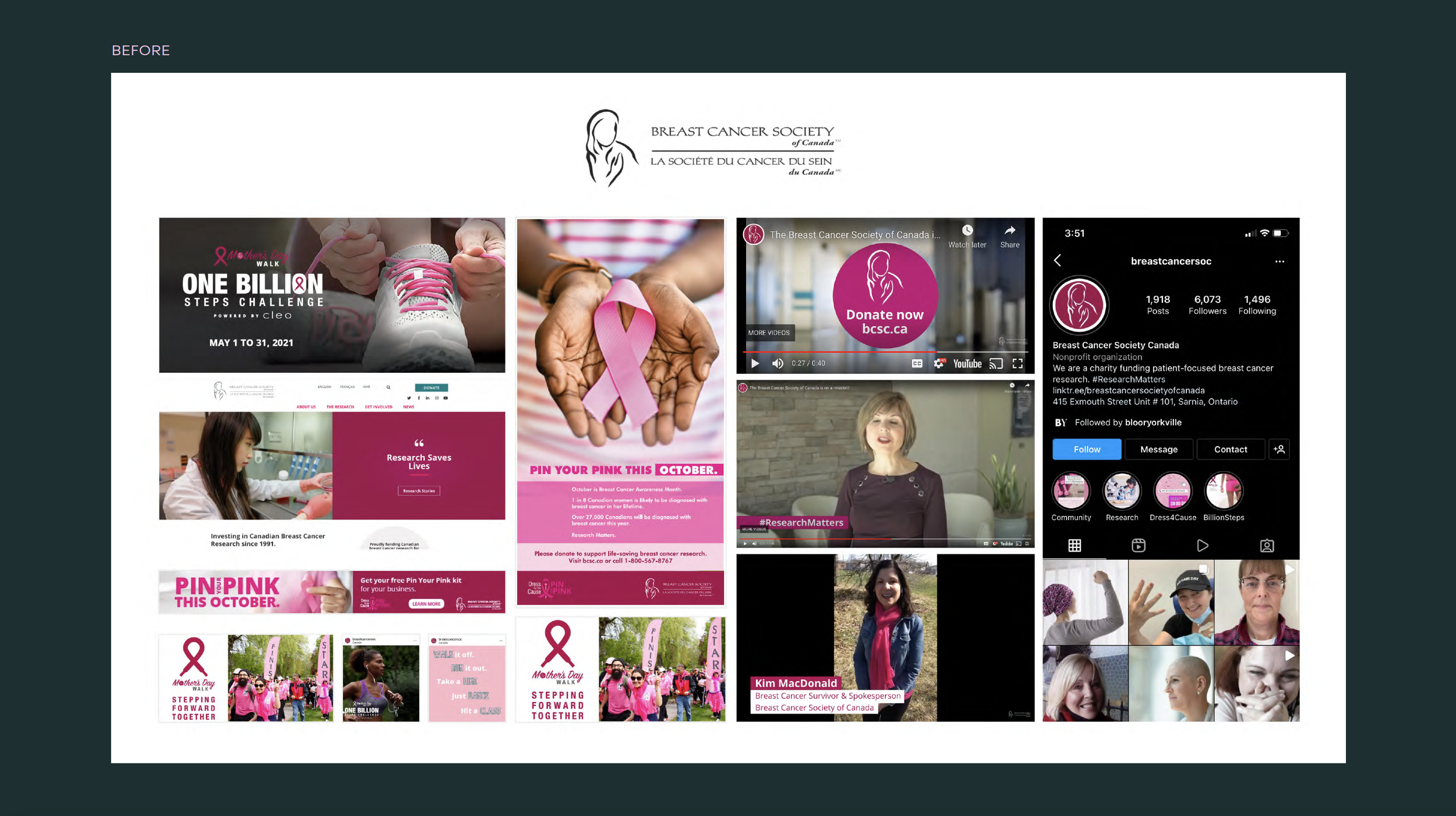
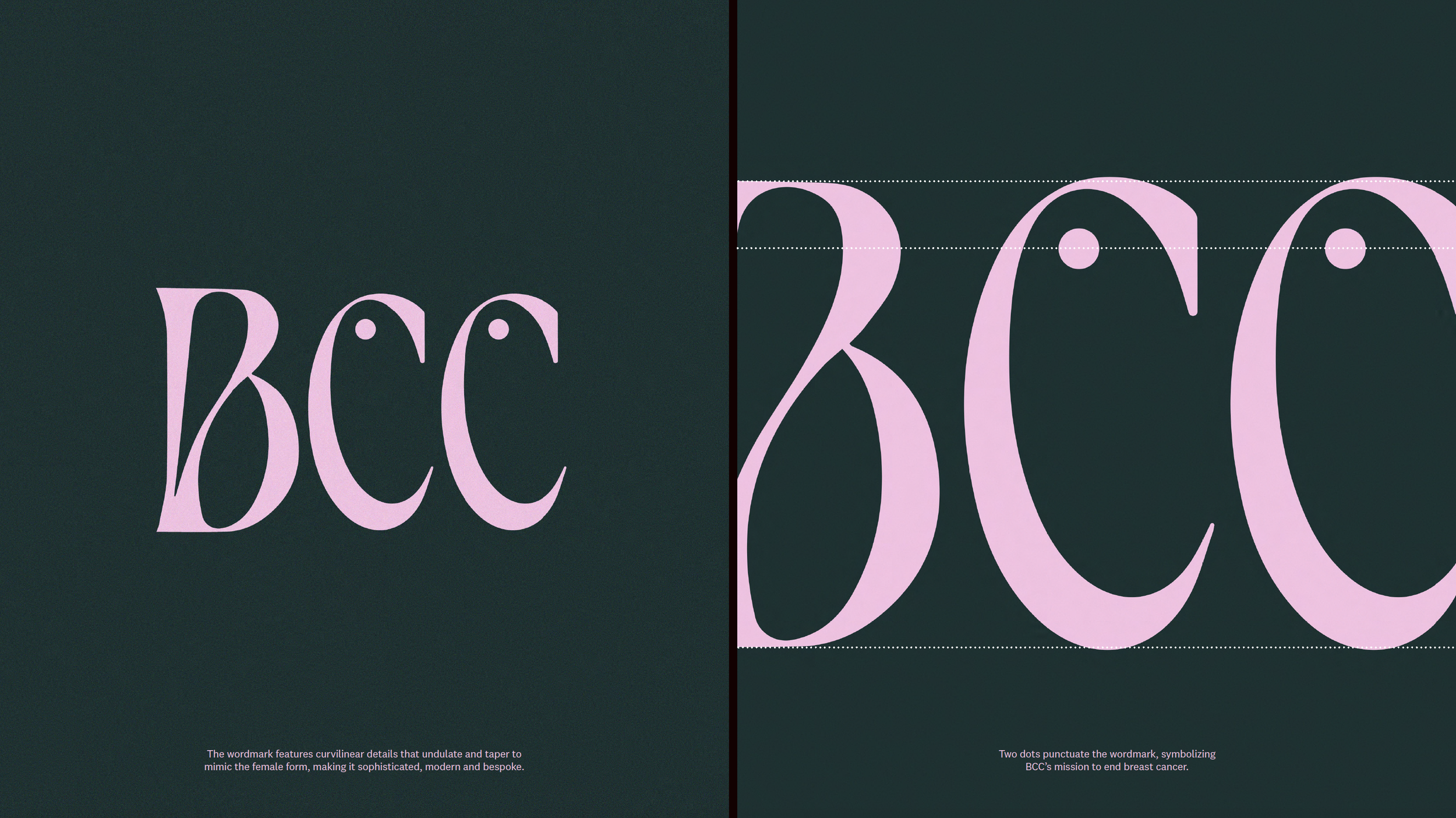
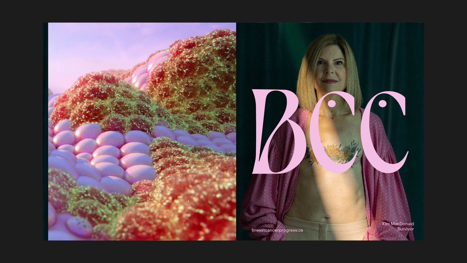
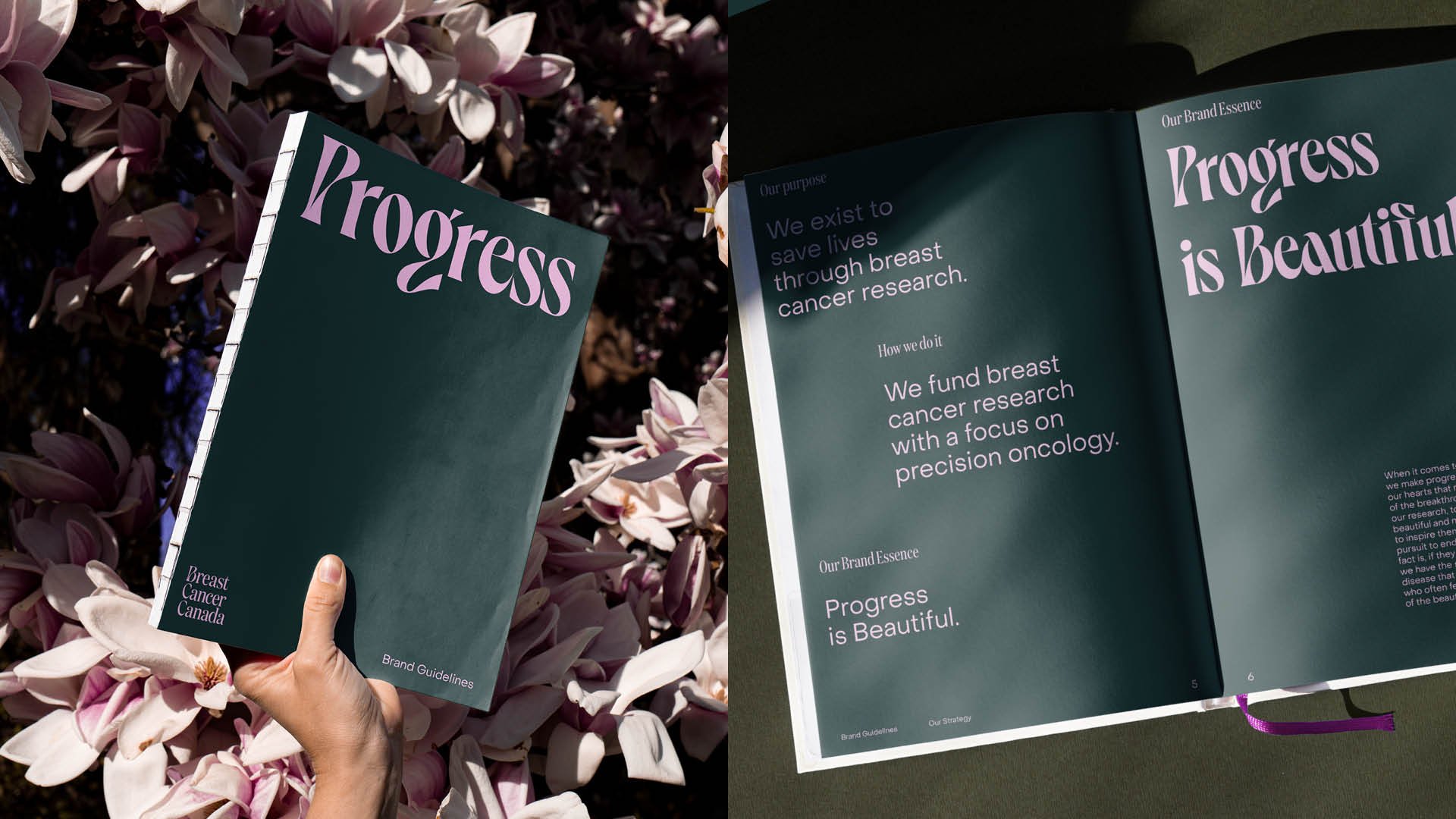
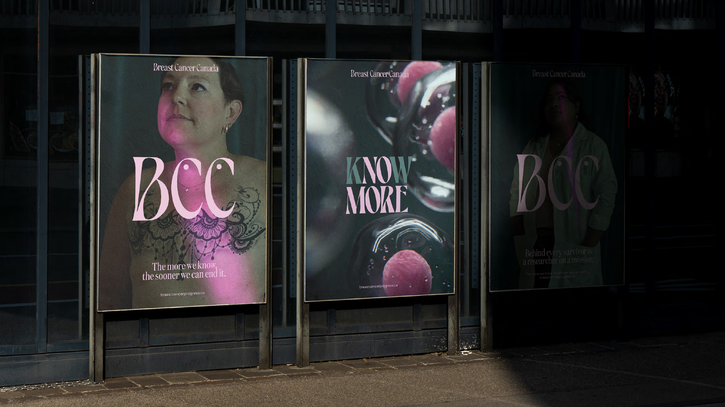
The new logo is designed to show the beauty in BCC’s important mission of saving lives, to better reflect the progress that they have made in precision oncology. The humanist letterforms provide a stark contrast to the cold hard science in clinical research category. The colour palette has been intentionally chosen to stand out amongst the sea of pink, we ground our brand in green which symbolizes health, vitality and fertility.
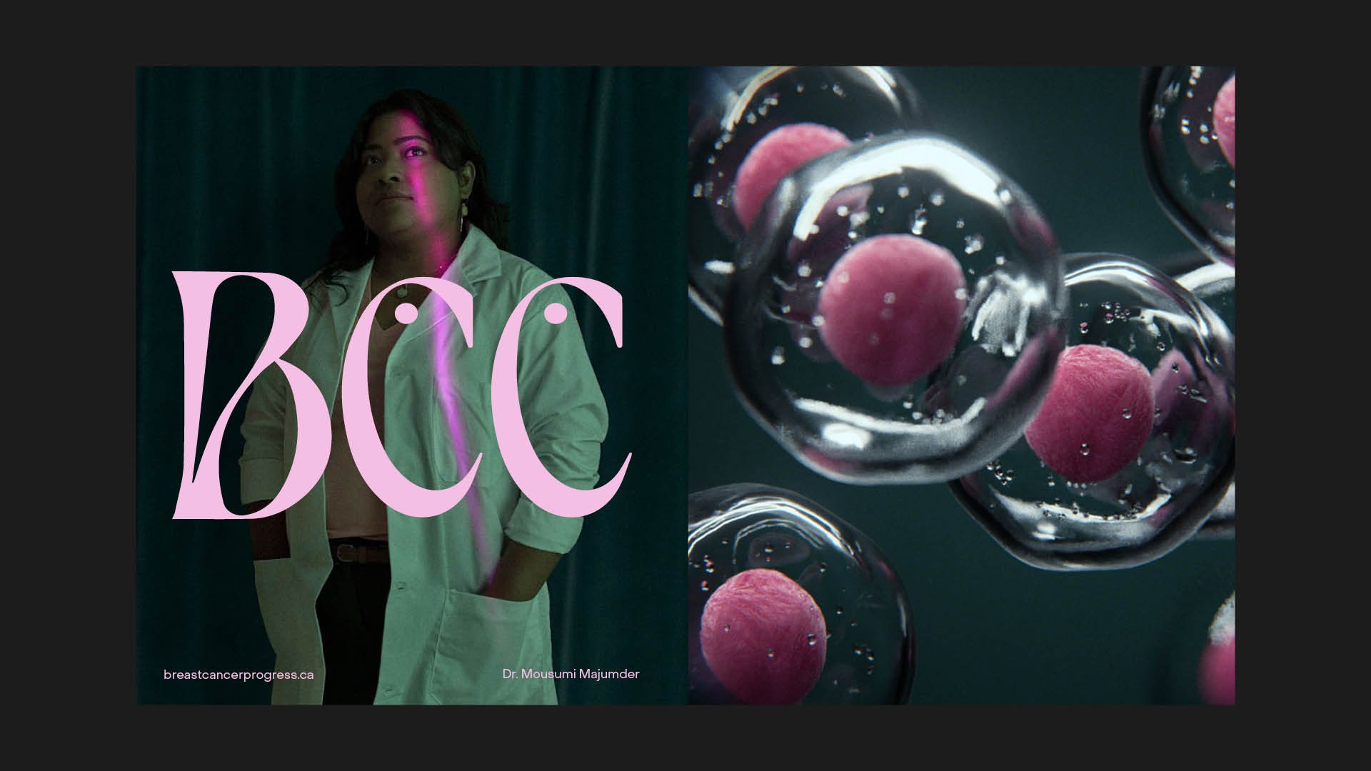
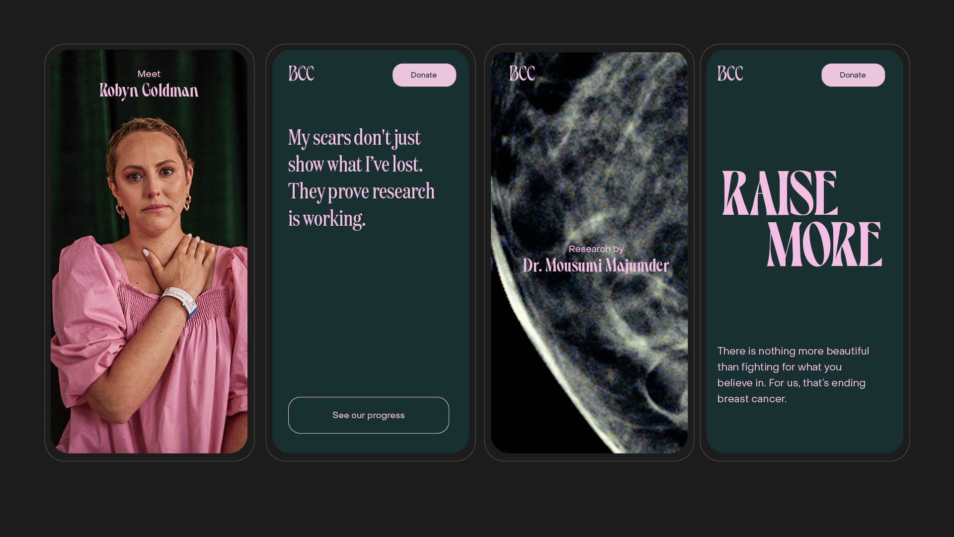
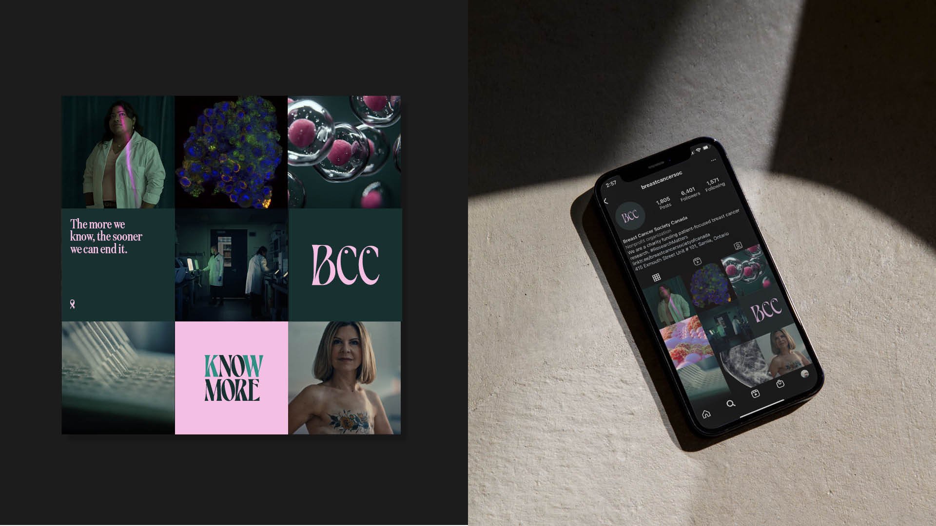
From photography to film, each image conveys the beauty of progress. It spans from CGI imaging of macro of cell biology to capturing the resilience our researchers and survivors. Each image is intentionally created to create an emotional connection while featuring brand cues and leveraging our colour palette.
We’re so used to seeing the cold hard science when we think about clinical research. But if you take a step back and look at it differently you’ll see that it’s inherently beautiful. The cells and our bodies. Beautiful. The researchers dedicating their days to save lives. Beautiful. The people who help us through their invaluable donations. Beautiful.
To make a donation please visit BreastCancerCanada.com